An iconic establishment with a perfect product and an outdated image. And behind every change, a multigenerational board of directors that didn't want to lose what their brand was all about.
La Argentina has been making the best croissants in Belgrano for decades. The product was — and still is — exceptional. Their brand, however, didn't reflect that. Their visual identity was stuck in the eighties. The store interiors were frozen in the same decade. A place where the croissants far outshone the wallpaper.
We were contacted by Polo Galindo, an interior designer we've collaborated with for years. The client was the family board of directors of La Argentina: multigenerational, fiercely protective of the brand's legacy, and understandably wary of anyone who came in promising to "modernize" it.
The challenge wasn't designing something new, but finding a way to update the brand without anyone in the meeting feeling that they were losing the essence they had built.
The brief, in short: renew without breaking. Elevate without erasing. All of this to be done in the midst of a pandemic.
Don't rebrand. Rescue.
A multigenerational board of directors protecting forty years of heritage needs an evolutionary path, not a radical break. We defined what the brand couldn't afford to lose — name, lineage, recognition — and only then did we begin designing. The "no" was analyzed with the same care as the "yes".
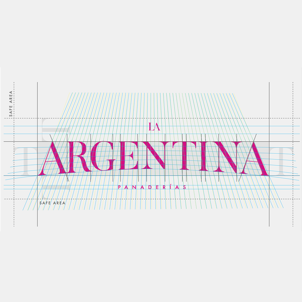
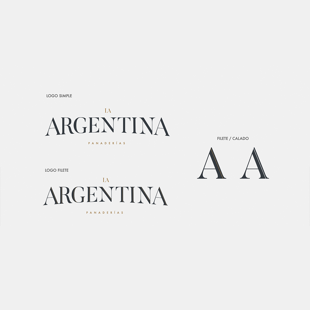
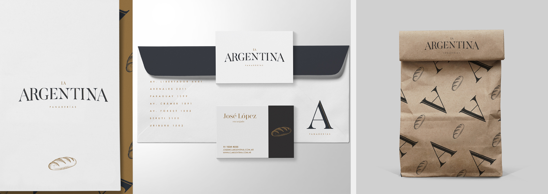
The reading of La Argentina remained intact. The typography was adjusted. High-quality proportions, optical adjustment, without breaking with what all the residents of Belgrano already recognized. The new logo feels as if it has always been there — only now, harmonious, delicate, and refined.
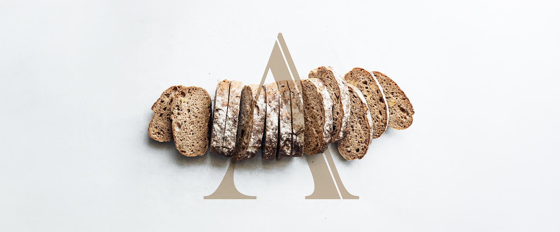
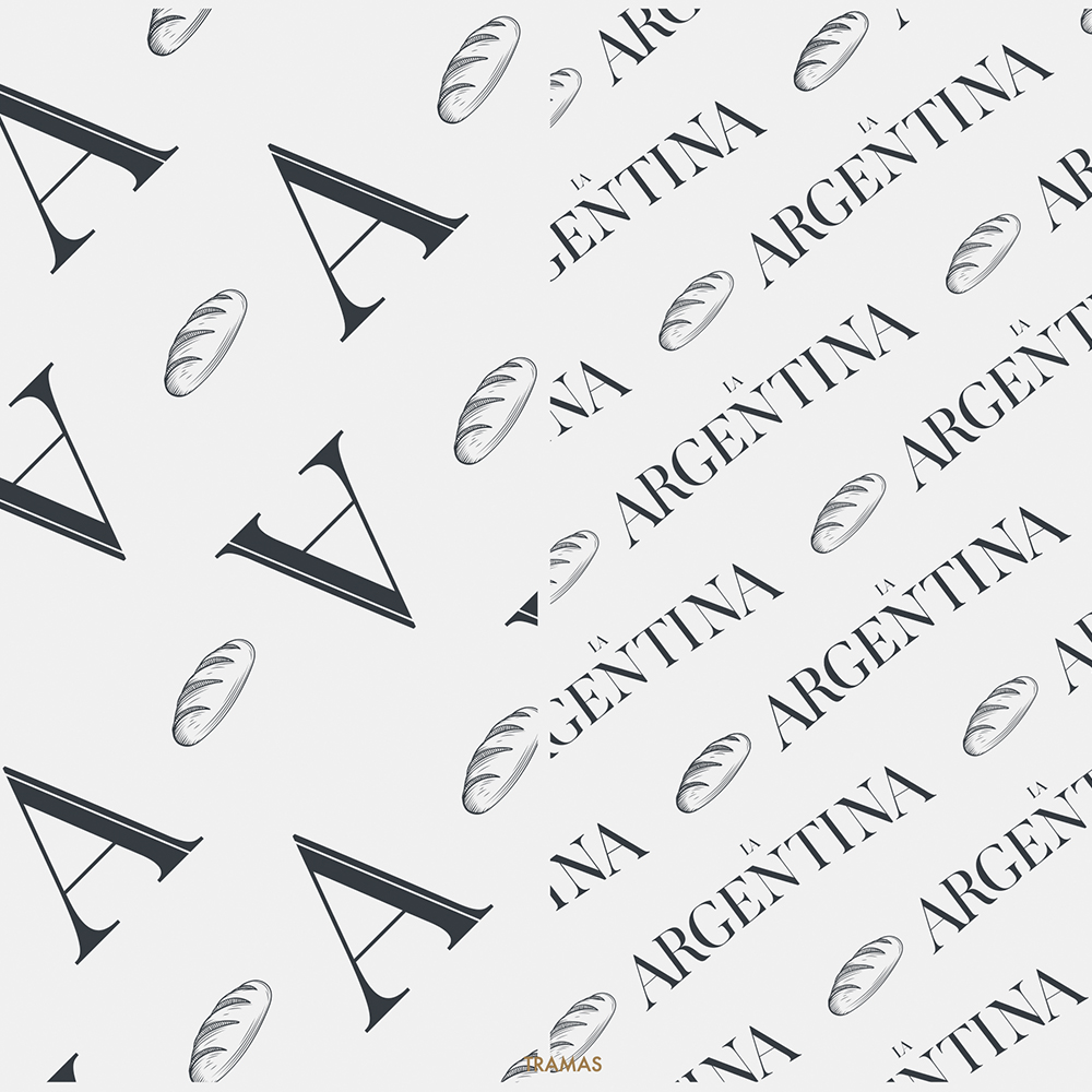
A single, custom letter — a tall, ornate "A" — designed to have three functions: a standalone logo on a box, a decorative stamp on a menu, and a large-scale architectural element on the facade. One letter, multiple functions, total system coverage.
The identity extended to the physical realm: signage, furniture, tableware, store decor. Polo's work throughout this entire phase of architectural and ambiance renovation was incredible — he knew how to represent every square centimeter of the stores as part of the brand system. A 1940s New York experience meets the Belle Époque, all accompanied by the best croissants in Belgrano.
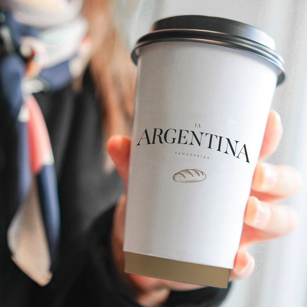
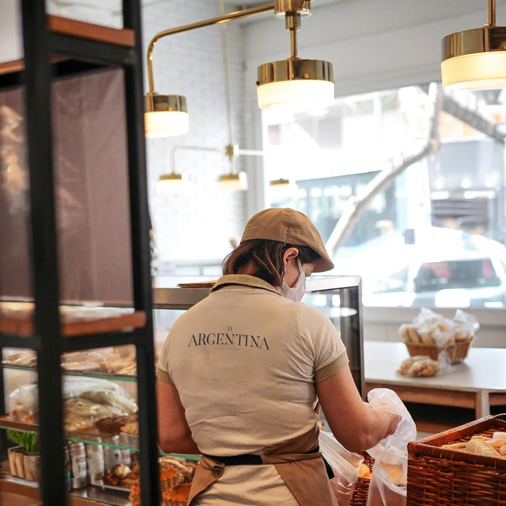


The brand retained its name, its heritage, and the trust of its owners that had protected it for decades. What changed was everything else: the typography, the color, the signage, the furniture, the display stand for the croissants. A renewal without disruption. In the midst of a pandemic. And it's still going strong.
When a brand has a history, the task is not to reinvent it, but to accompany it where the company is now and where it wants to go. Argentina was an example of this process.