Most studios design the label. We designed the wine. From vine selection in Mendoza to the bottle on the table, Vaccarezza Wines was a brand built entirely in-house — strategy, vintage, packaging, direct-to-consumer site.
Vaccarezza wasn't a client brief. It was the answer to a different question: what does a branding studio look like when it sits on both sides of the table?
We chose four varietals — Malbec Roble, Cabernet Franc, Sauvignon Blanc and a sparkling. We traveled to Mendoza, picked the vintage, and built every label, collarino and communication piece from scratch. The bottle that finally hit the table was a Vaccarezza decision from grape to glass.
The brand had to look premium enough to compete with established Argentine wineries — but we couldn't lean on heritage we didn't have. We had a name. We had the wine. We had to invent everything in between.
No client to convince. No committee to negotiate with. The only project where the studio was also the brief.
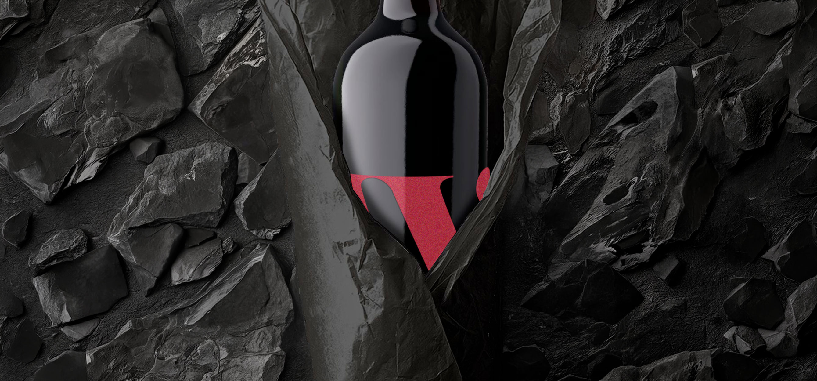
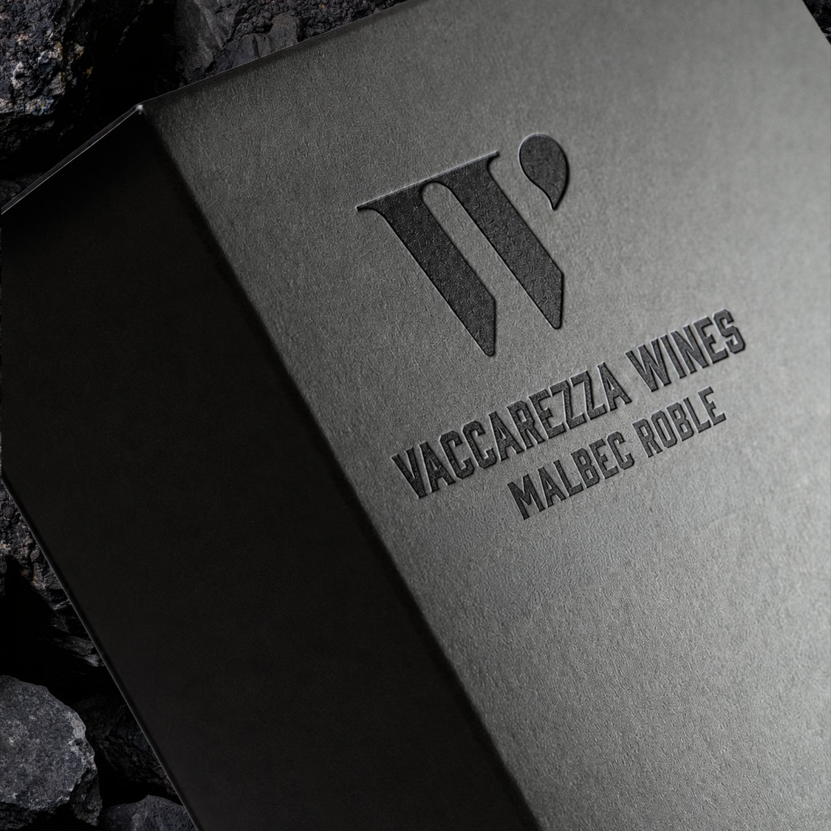
Skip the vineyard cliché. Build the brand around the only thing that mattered: the W and the drop.
Selected four varietals that cover the spectrum: Malbec Roble for body, Cabernet Franc for character, Sauvignon Blanc for tension, sparkling for occasion. The brand wasn't decorating the wine — it was choosing it. Every editorial decision in the system flowed from a tasting decision in the cellar.
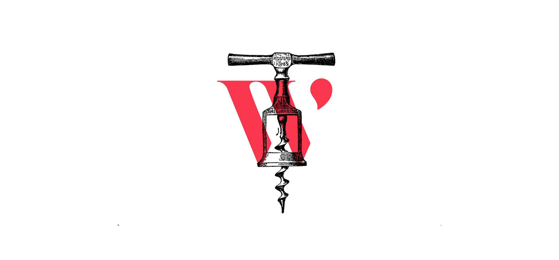
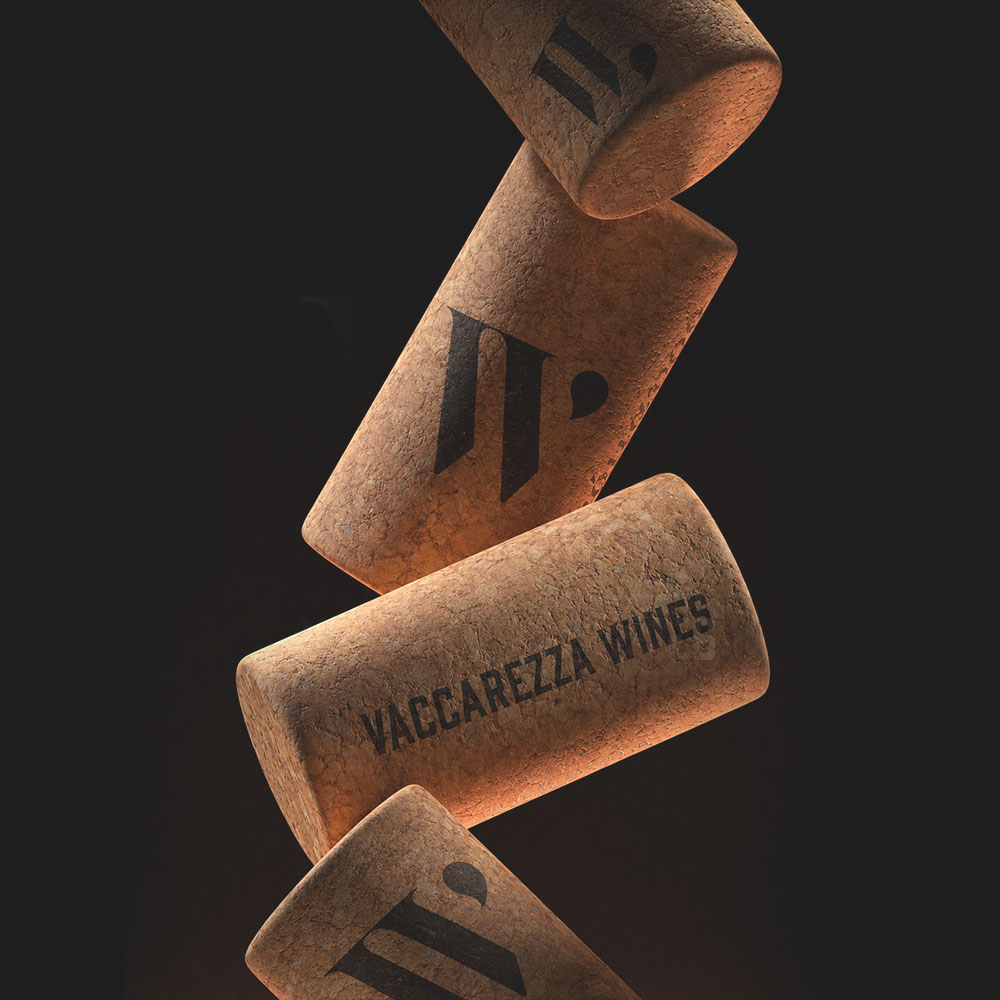
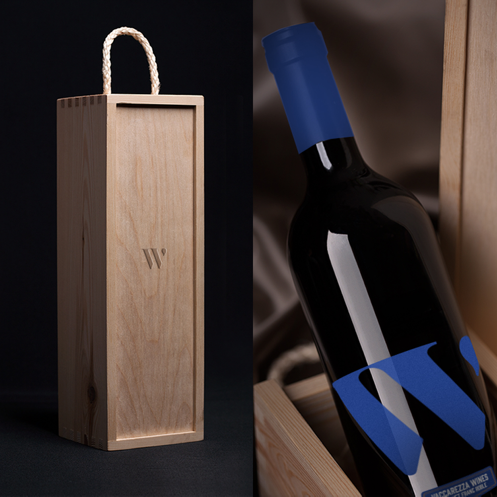
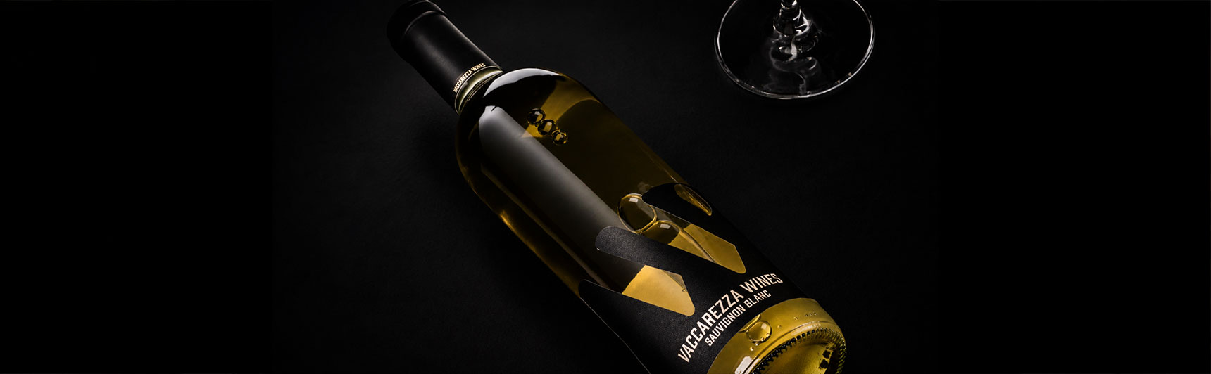
The W from Vaccarezza, drawn wide and geometric, with a single drop floating at its shoulder — the drop of wine itself. Monogram and metaphor in the same gesture. A mark that reads at any distance, on any surface, in any colour.
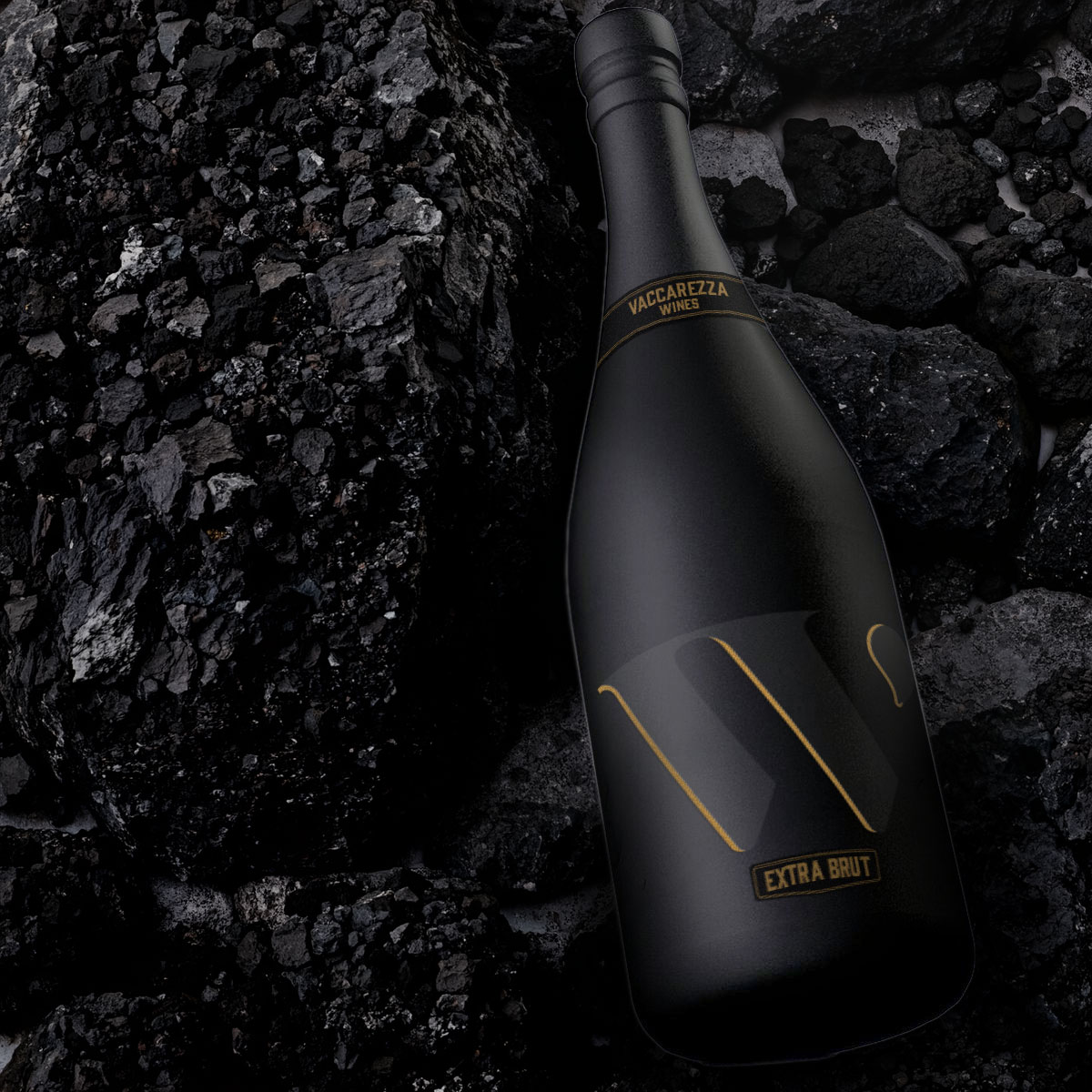
Instead of the classic neck-and-label dressing every winery uses, each cepa owns a chromatic territory. Magenta for Cabernet Franc, gold-amber for Sauvignon Blanc, deep red for Malbec Roble, navy for the sparkling. The W stays. The colour changes. Recognition and variety in the same system — the line reads as one, drinks as four.
Built the e-commerce site as part of the brand, not as an afterthought. The wine is sold where the brand lives. No middlemen, no distributor markup, no aisle competing for shelf space. The bottle, the box, the site — one continuous object.

Vaccarezza Wines is what UPA looks like when it sits on the other side of the brief. From vineyard selection to packaging to the e-commerce site, every brand decision was a business decision — and vice versa. The proof that the studio can think product, not just communication.
When the studio is also the client, every shortcut shows up in the bottle. Vaccarezza taught us more than any external brief — and made me a better partner for the ones that came after.